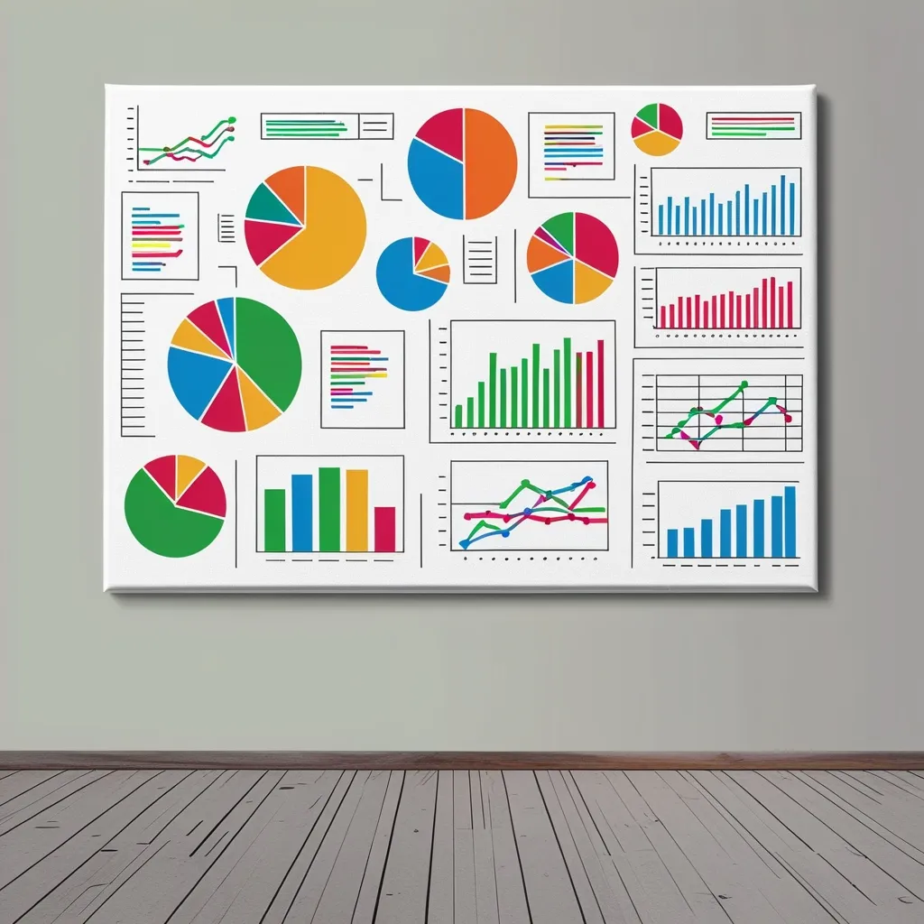
When it comes to tracking progress in any area of life—be it education, project management, or personal goals—visual aids like charts and graphs are truly game-changers. These tools are more than just visually appealing; they simplify complex data, making it easier to see trends, achievements, and areas needing improvement in a single glance.
Why Visual Aids Matter
Visual aids like charts and graphs go beyond their aesthetic value; they play a crucial role in helping you stay focused on your goals. For instance, in the field of education, teachers utilize graphs to monitor student performance over time. By plotting scores, educators can quickly identify whether a student is progressing adequately or if there are areas needing extra help. This makes it easier to make informed instructional decisions and adjust teaching strategies as needed.
In project management, charts and graphs are indispensable for tracking project components against planned objectives. Tools like burndown charts and burn-up charts allow teams to visualize remaining work relative to the time required to complete it, facilitating better resource allocation and project planning.
Types of Charts for Progress Tracking
Bullet Graphs
Bullet graphs are particularly effective for comparing performance against specific goals. These graphs display the current status of a metric relative to a target, providing context through ratings or performance indicators. For instance, you could use bullet graphs to monitor revenue, profit, customer satisfaction, or new customer acquisition. This type of graph is excellent for year-over-year data analysis and can aid teams in identifying potential roadblocks by presenting data in a tight visual format.
Column + Line Graphs
Column + line graphs, also known as dual-axis charts, are ideal for comparing two data sets with different measurement units. These graphs allow you to track trends over time while comparing different metrics, such as rate and time. This is particularly useful in marketing where you might be looking to track website traffic alongside conversion rates.
Gantt Charts
Gantt charts are horizontal charts that map tasks over time, making them perfect for road mapping and progress monitoring. Widely used in project management, these charts visualize the timeline of tasks and ensure that projects stay on schedule.
Bar Graphs
Bar graphs are simple yet effective for tracing progress over time. In educational settings, students can use bar graphs to track their progress in subjects like math or reading. For example, a student might use a bar graph to track their improvement in addition or subtraction timed tests, which can serve as a big motivator to improve fact fluency.
Design Best Practices
Creating clear and effective charts and graphs involves good design practices. Here are some tips:
- Contrasting Colors: Use different colors to highlight how the data is progressing. This makes it easier to understand trends and comparisons at a glance.
- Consistent Scales: Ensure that the scales on your graphs are consistent to avoid misleading interpretations. For example, if you’re tracking progress over time, the time intervals should be uniform.
- Clear Labels: Label your axes clearly and include a legend if necessary. This makes it easy for anyone looking at the graph to quickly grasp what the data represents.
Real-World Applications
Education
In classrooms, visual aids are powerful tools for motivating students and tracking their progress. Teachers can use line graphs to show students their progress in reading fluency or math skills. For example, a Words Per Minute (WPM) graph can help teachers track students’ reading progress throughout the school year. This visual feedback can be highly motivating for students, helping them see their growth and set new goals.
Project Management
In project management, charts and graphs help teams stay organized and focused. For instance, a burndown chart visualizes the remaining work relative to the time required to complete it, aiding teams in estimating task duration and planning resources more effectively. On the other hand, a burn-up chart tracks the amount of work completed, providing a clear picture of project progress and resource allocation.
Personal Goals
When it comes to personal goals, visual aids can be equally effective. Imagine tracking your fitness progress with a line graph that charts your weight loss or workout milestones over time. This visual representation can be a strong motivator, helping you stay committed to your goals.
How to Implement Visual Aids
Implementing visual aids for progress tracking is pretty straightforward and can be done using various tools:
- Spreadsheets: Tools like Excel or Google Sheets provide templates and functionalities to create a variety of charts and graphs. You can enter your data and let the software generate the visual representation.
- Graphing Software: Several software options specialize in data visualization, often coming with pre-made templates and user-friendly interfaces.
- Manual Graphs: For a more hands-on approach, you can manually create graphs using paper and pencil. This method can be particularly useful in educational settings where students can participate in the process and learn how to graph their own scores.
Benefits of Visual Aids
Using visual aids for progress tracking comes with many benefits:
- Motivation: Seeing progress visually can be highly motivating. Whether it’s a student improving their reading skills or a team completing project tasks, visual feedback can boost morale and encourage continued effort.
- Clarity: Visual aids simplify complex data, making it easier to understand trends and patterns, which aids in making quick decisions and adjustments.
- Communication: Charts and graphs provide a clear and concise way to communicate progress to stakeholders. In project management, this helps keep team members and stakeholders informed and aligned.
Conclusion
Visual aids like charts and graphs are indispensable tools for tracking progress in any area of life. They offer a clear, visual representation of data that can motivate, inform, and guide decision-making. By choosing the right type of chart and following best practices in design, you can ensure that your visual aids are effective and easy to understand. Whether you’re a teacher monitoring student performance, a project manager tracking project components, or an individual working towards personal goals, visual aids can help you achieve your objectives more efficiently.